Case study
Hıfzı Kuruşa.
A digital legacy and archive site — one man's story from 1956 Yugoslavia to Ankara, a fifty-year restaurant, a foundation, and a press archive, composed like a printed memoir.
- Role
- Designer & engineer
- Platform
- Web
- Stack
- Astro · TypeScript · Custom design
- Year
- 2026
A life, archived
Hıfzı Kuruşa is a third-generation Ankara tradesman whose family came from Yugoslavia in 1956, carrying — as the site puts it — one suitcase, one recipe, three generations. His name connects a fifty-year köfte institution, a cultural foundation, and half a century of newspaper ink.
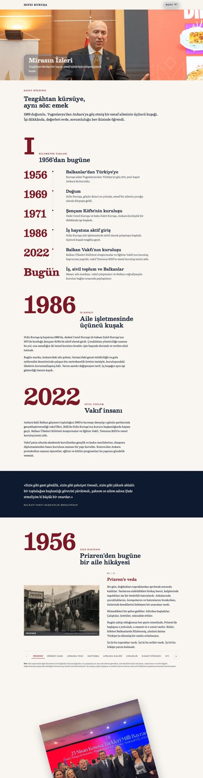
A life like that doesn't fit a corporate template, so this isn't one. It's built as a digital memoir: a horizontal home where each chapter is a card you travel past, long editorial pages set in serif type with numbered years, and margin notes that read like a curator's labels. Cream paper, deep navy, archive red.
Underneath, the site is a static Astro build — custom-designed from the wordmark down, fast everywhere, with every photograph, clipping and recorded conversation treated as an archival object. It's less a website about a person than an archive that happens to have an address.
What it does
A horizontal home
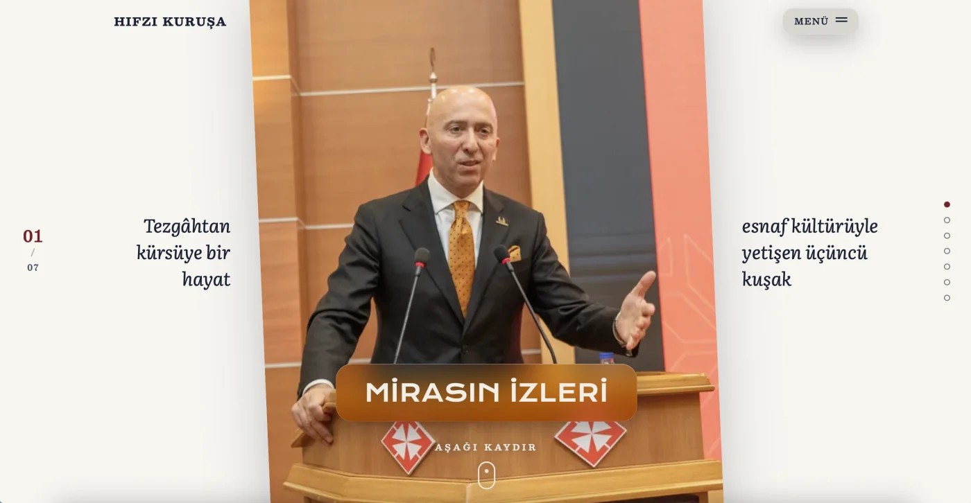
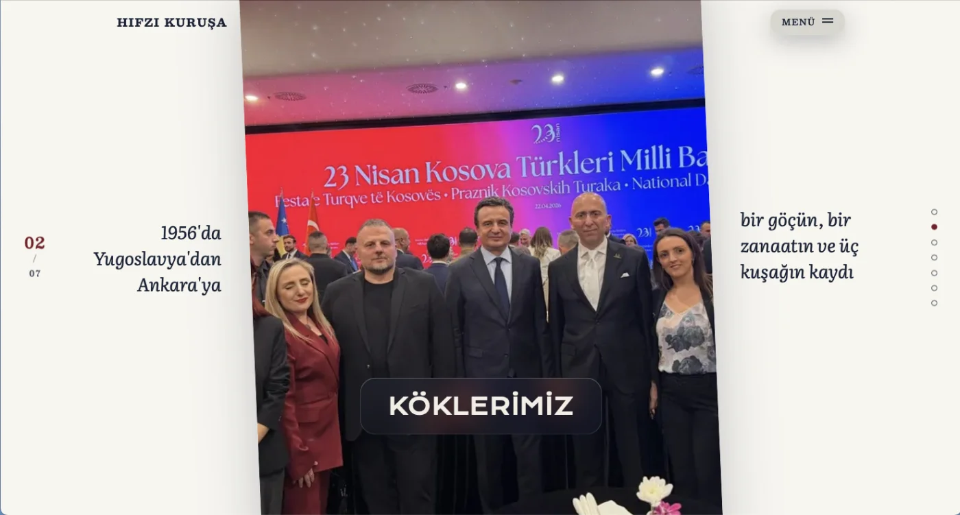
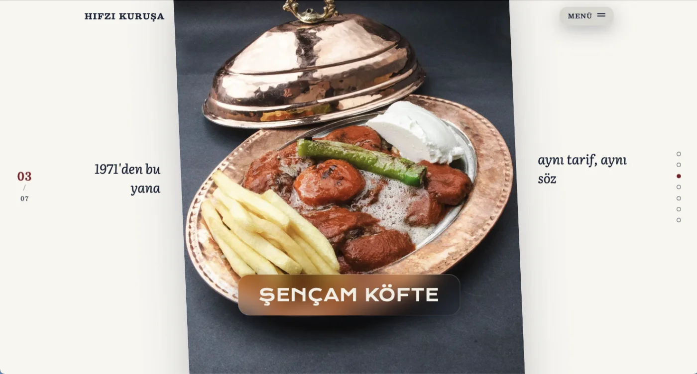
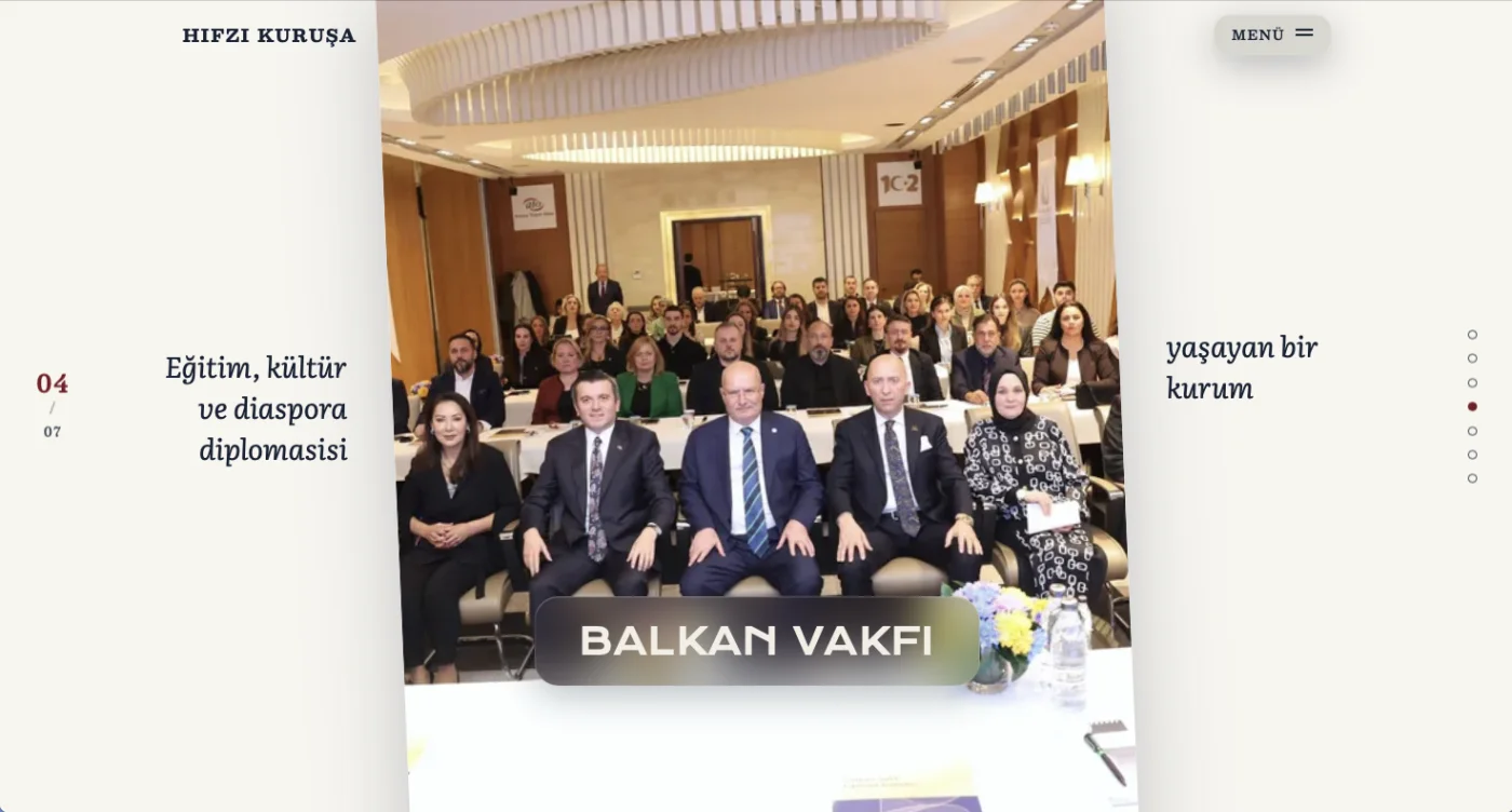
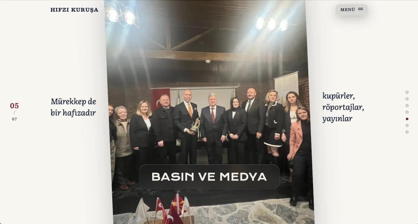
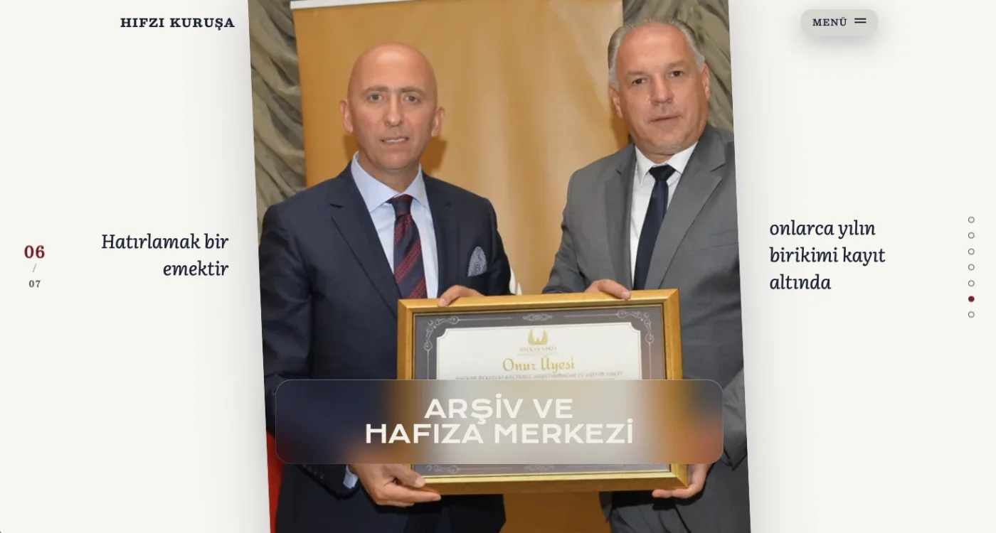
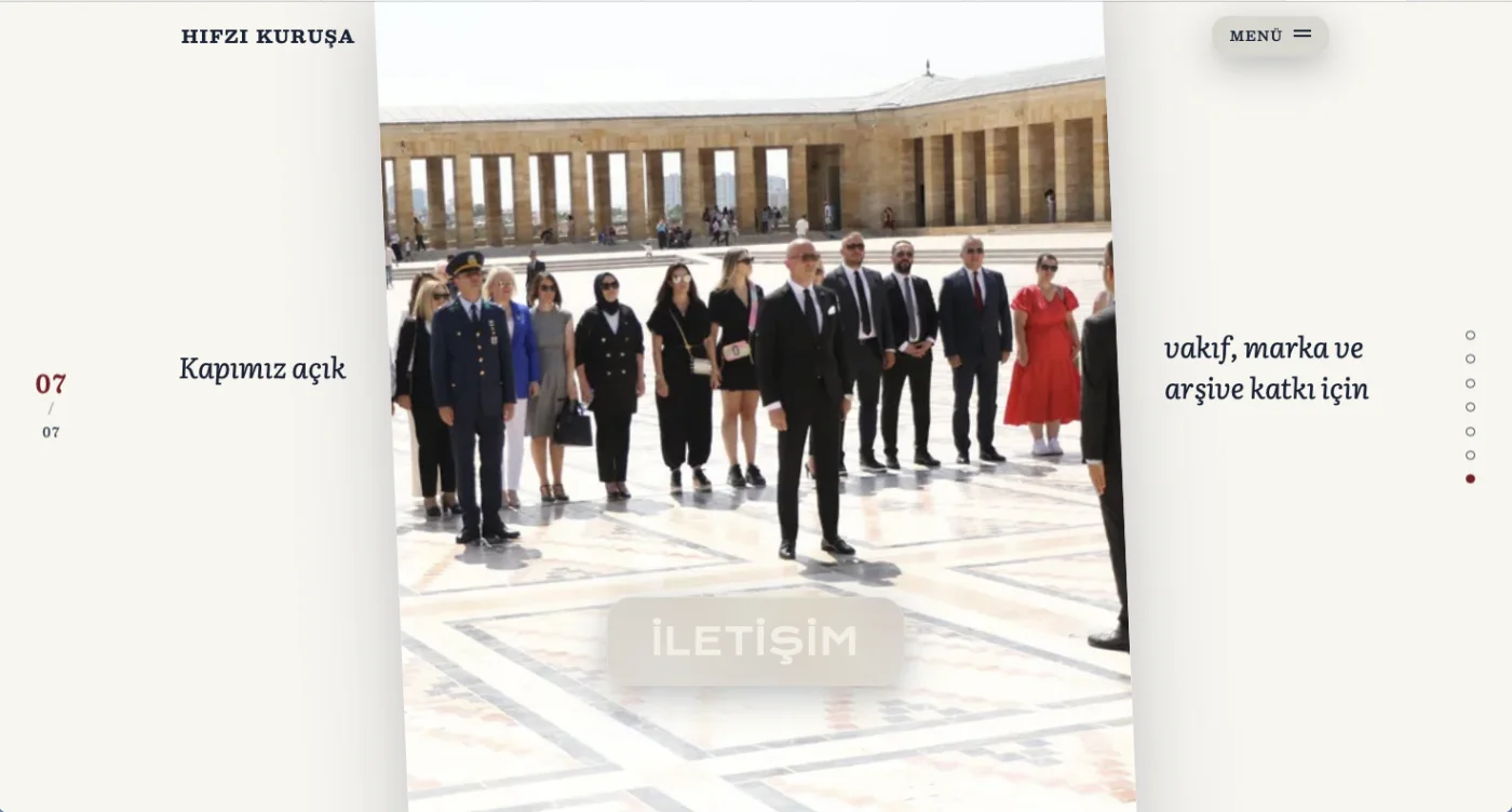
The landing page is seven full-screen chapters you move through sideways — each one a floating photo card with its own title, margin notes and place in the story.
Editorial timelines
The life story unfolds through numbered years — 1956, 1971, 1986, 2022 — set in big serif numerals with long-form Turkish prose, like a printed memoir brought online.
Three legacies, one site
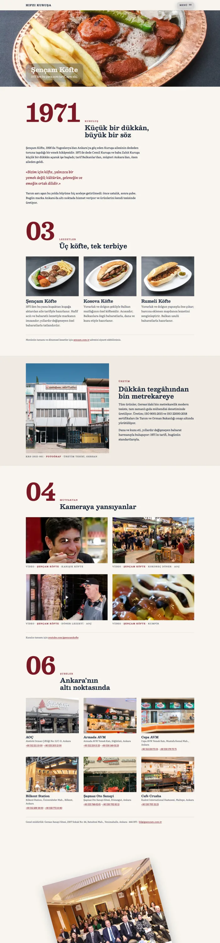
The personal story, the Şençam Köfte restaurant founded in 1971, and the Balkan Vakfı foundation each get their own chapter — connected, but told in their own voice.
A living press archive
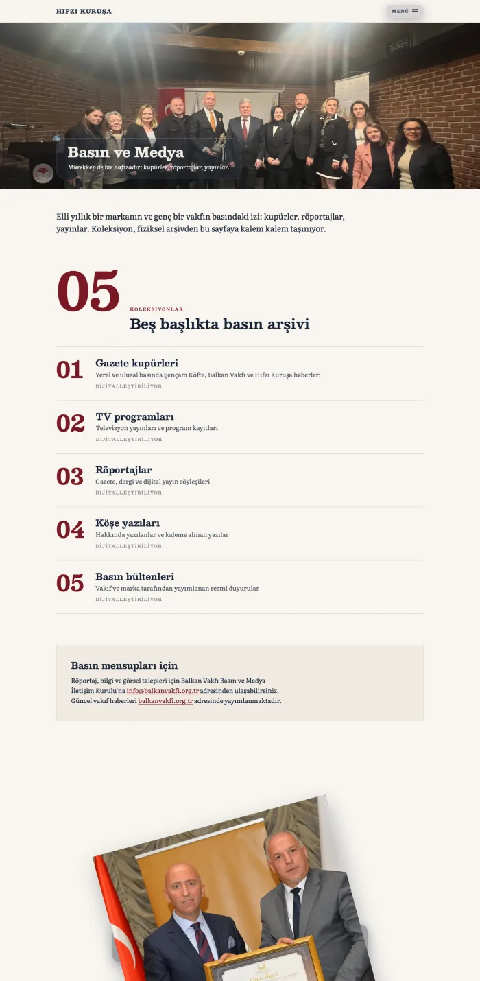
Fifty years of newspaper clippings, TV programs, interviews, columns and bulletins organized into five browsable categories — with a note inviting journalists to contribute.
Memory center
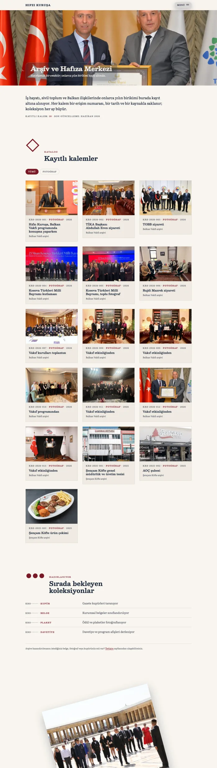
An archive of recorded conversations — “kayıtlı kalemler” — presented as a video grid, preserving decades of testimony in the subject's own voice and others'.
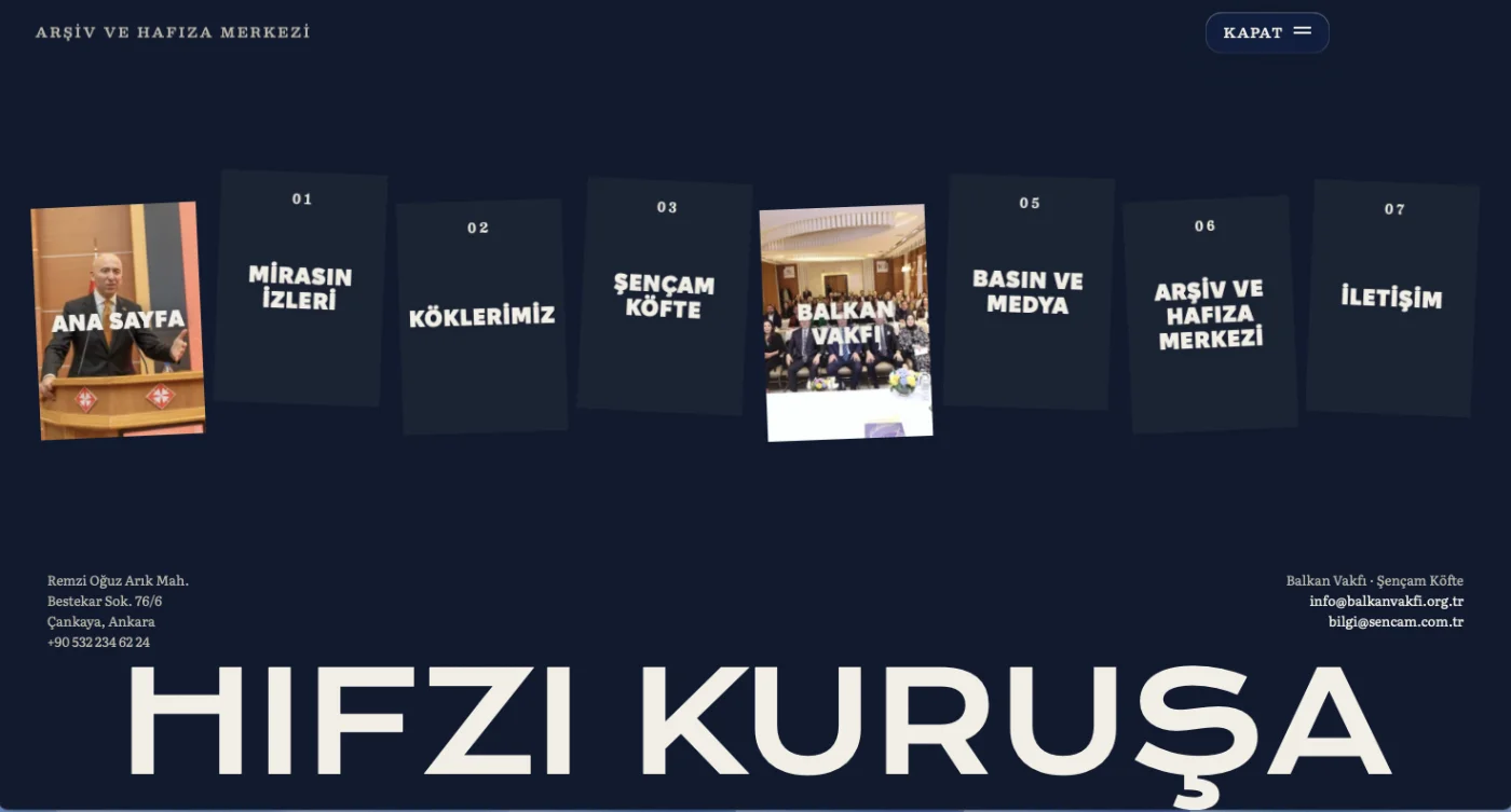
Fullscreen chapter menu
The menu takes over the screen: every chapter as a card, contact details for the foundation and the restaurant, and the wordmark set gigantic across the bottom.
Seven chapters
The home page moves sideways — every screen a chapter of the story.
Pages built to be read
The chapters open into long editorial pages — timelines, archives and family history, top to bottom.
Under the hood
- Astro static build — content-heavy pages compiled to plain HTML, so a site full of photographs and archive material still opens instantly.
- Editorial type system — Besley and Literata serifs carry the memoir tone, from giant timeline numerals to margin annotations.
- Custom design language — cream paper, deep navy and archive red; horizontal chapter navigation; every image framed like an exhibit.
- Archive-first structure — press clippings, recorded interviews and family photographs organized as a browsable, growing collection rather than static gallery pages.